We at Vtiger CRM are thrilled and excited to present you with an aesthetically pleasing new blog design!
But, the question that must be popping into your mind is, How is a new blog design going to benefit me? or Why should I care?
If you are a regular reader of our blogs, you can see a major difference in terms of design, style, blog navigation, etc. Our motive has always been to provide a superior browsing experience. And this time, it is more nuanced and advanced.
Also, an updated and modern UI can make a blog visually appealing and user-friendly, making it easier for readers to navigate and find content easily.
Let me give you a sneak peek of what has changed in the new blog version before delving into its details:
In the old version,
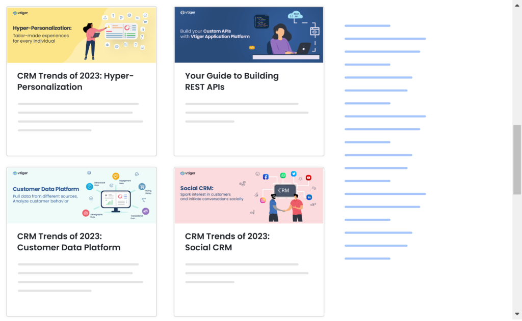
- There was no subscribe button to keep customers updated on the new blog post.
- It was slightly difficult to get access to popular blogs without depending on the search bar.
- The blogs were cluttered with numerous categories.
- There was no way to track user experience.
In the new version, you will find
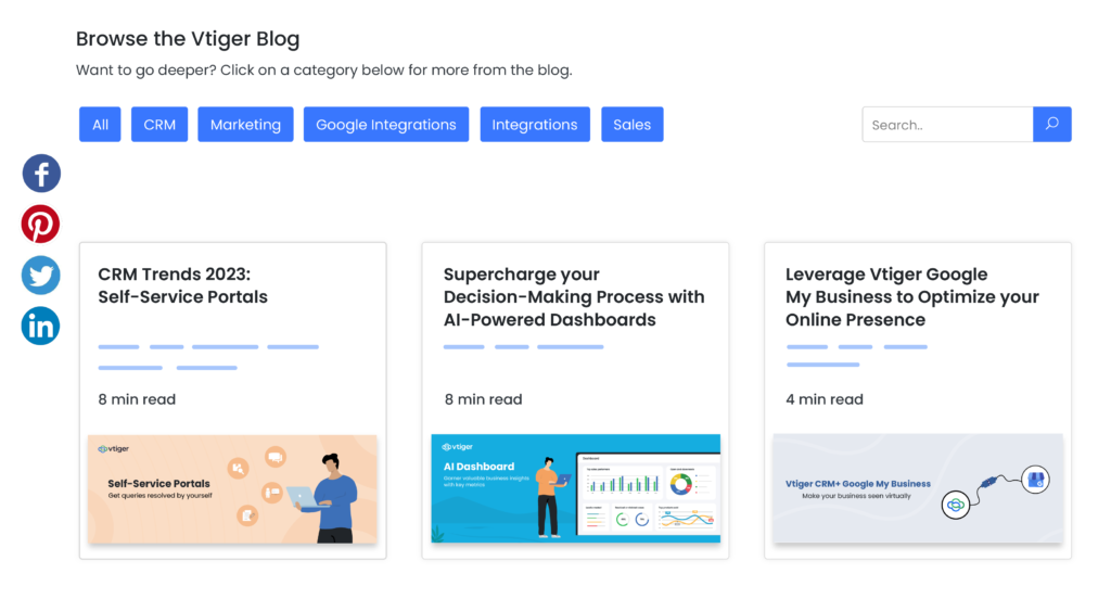
- A subscribe button to get instant updates
- Popular blogs pinned at the top
- Smart categorization of the blogs
- Seamless navigation with less scrolling
- A feedback button to rate your experience
Let us dive deeper into the new version for more clarity.
Vtiger Blog, a brand new look and feel
Our organization’s primary focus is on the user experience. We are constantly striving towards elevating customer satisfaction. It’s not just the content that we present to you but we majorly emphasize delivering a holistic experience without a fail.
With digital mediums rising exponentially, consumers prefer to consume content online as well. Therefore, we decided to expand our offerings by launching a new layout, design, theme, etc., to optimize your browsing experience. This will allow our readers to access our blogs easily.
Let me plunge into the next section to explain in detail what’s new in-store
New and Improved UI

The new UI promises to revolutionize the way users interact with the platform, providing a more streamlined and user-friendly experience. With a clean and modern design, the new UI has been developed with the end-user in mind, making it easier to navigate and access all the important information they need.
The updated interface includes a subscribe button, a search button, and so on. You will also get a rough estimate of how long you might take to read the content of a blog post. It will display 4 min read, 6 min read, etc., which can help you decide how much time you want to spend on blog content.
Intelligent grouping to access blogs at fingertips

Blogs are grouped logically which leads to improved discoverability. Our main focus is on increasing visibility so that you can spend less time searching for content and more time consuming it.
For instance, if you want to read blogs on sales. You can switch to the sales category and discover sales-related content such as lead management, sales enablement tools, etc. This will help you in accessing only those blogs that serve your interest.
Subscribe and stay updated on the latest blogs via email

By subscribing, you will receive regular email updates with the latest blog content, without having to regularly check the site. You can enter your email address to start receiving updates. This way, you will never miss a beat on the content that holds your attention.
Popular blogs will be pinned on the top
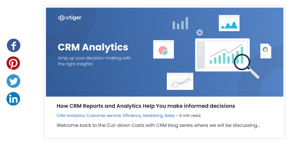
The most frequently read or high-quality blog posts will be displayed at the top of the blog’s homepage. This allows you to refer to blogs when you need them rather than searching for them all the time.
Leave your thoughts by clicking on the feedback button
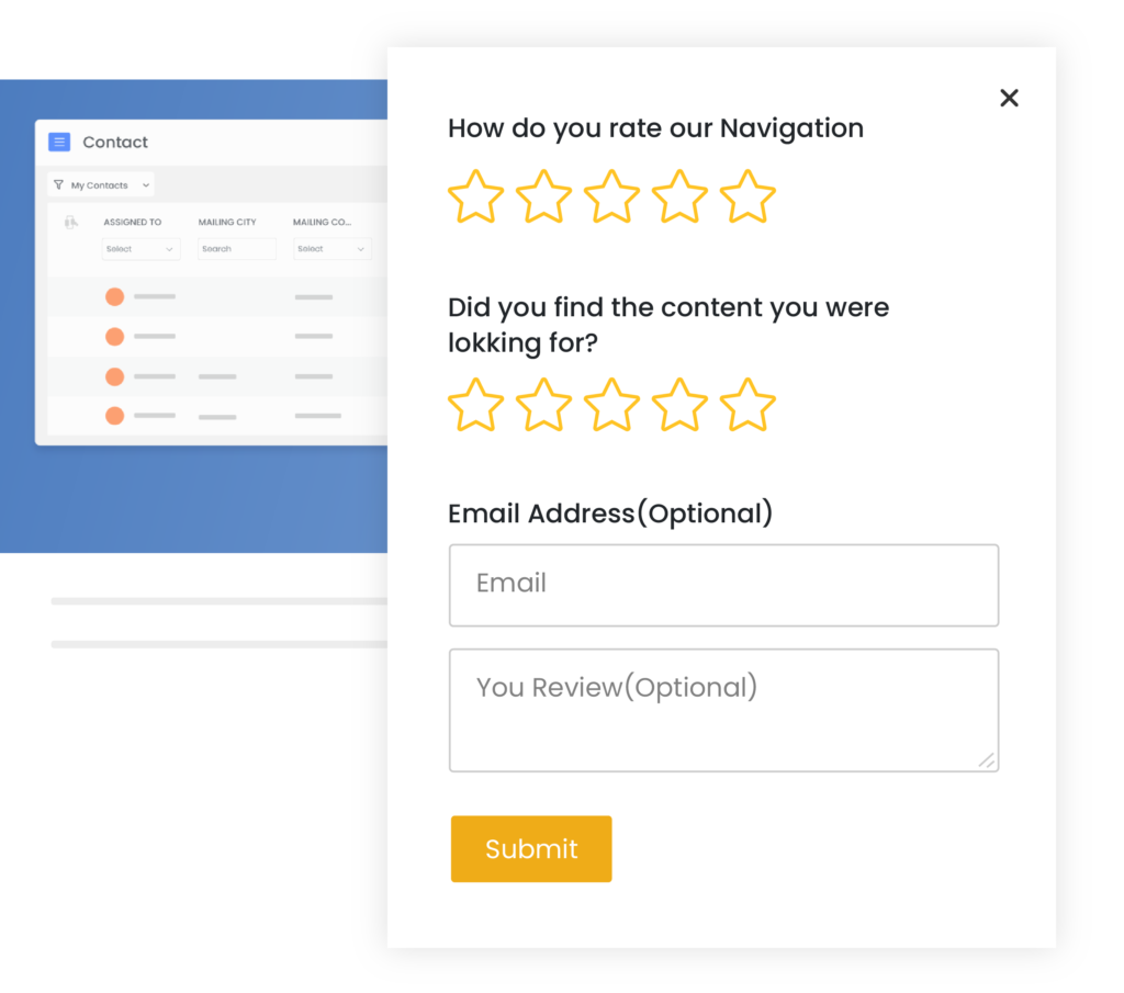
You can submit your feedback by giving five-star ratings on your browsing experience. This way we will be able to improve the usability to align with your choice and preferences.
Track to gauge user experience
We have a dedicated team to improve your experience with us and we will be monitoring your interactions to gain insights. Such insights will help us to serve you better. We aim to continuously improve and tailor our content to meet your demands.
The overall look and feel of the Vtiger blog will be different from our existing website design.
Wondering why? Let me explain
Blogs are a repository of content that is used to inform readers. With newly added features like subscribe button, blog grouping, etc., it will be easier for you to search for information and reduce your time scrolling for the content.
